
- 1. What do you do if an app or a service in your phone is kludgy to use? Most of the time you just ditch it and uninstall – according to Forrester Research, 58% of people do that. And now, imagine that you HAVE TO use software that is unintuitive, needlessly complex, impedes working with data, and generally doing anything with it is like going to the dentist: you know you can’t avoid it and that it’s going to hurt. Also, imagine that this software is supposed to “support” making important decisions, including business ones.
- 2. This, sadly, is the daily bread for millions of people all over the world who use enterprise systems and applications.
- 3. UX in enterprise software – why are things so bad
- 4. Red flags
What do you do if an app or a service in your phone is kludgy to use? Most of the time you just ditch it and uninstall – according to Forrester Research, 58% of people do that. And now, imagine that you HAVE TO use software that is unintuitive, needlessly complex, impedes working with data, and generally doing anything with it is like going to the dentist: you know you can’t avoid it and that it’s going to hurt. Also, imagine that this software is supposed to “support” making important decisions, including business ones.
This, sadly, is the daily bread for millions of people all over the world who use enterprise systems and applications.
As someone dealing with UX, I feel a little guilty about that. After all, I have already been designing instances of user experience for 15 years. On the other hand, by focusing mostly on enterprise solutions in the past few years, surely I have atoned for at least some of my offences?
Whatever the case, the subject deserves more attention and needs to be preached far and wide, as companies often remain blissfully unaware of the risks resulting from negligence in this area.
In addition to demotivated employees, who wince at the very thought of turning on their computers on Monday mornings, poor UX of business apps leads to higher costs, lost opportunities, and above all, low ROI on the digital transformation. And in extreme cases, low personnel loyalty and increased staff attrition.
This catastrophe can be avoided. But how to spot early on that something is off?
The job of the UX is both identifying and solving problems. It is finding out the users’ expectations, their challenges and the context they are in. Good UX is mostly associated in people’s minds with consumer-grade products, and it is the design of apps in B2C that we expect the most from. And enterprise solutions? We have grown used to things being otherwise, and we have accepted that these systems “are what they are”, because they serve different purposes.
UX in enterprise software – why are things so bad
I used to be part of a team working for one of the tycoons of FMCG. Our task was simple – to investigate a system used for managing document circulation. We applied the best methodology: we did full research, mapped the processes, observed users working with the app, scrutinized the heuristics and… It turned out that much of the system is completely useless, as most of what it was supposed to do, the users were already doing in other apps. Instead of redesigning the system, we recommended removing most of the tabs and focusing on the one that was providing value to the users.
This situation is far from unusual. The company uses its budget and implements a solution because someone thought it would be needed. That someone certainly is not a user of this solution, and the solution has not been designed or implemented in collaboration with its users.
Usually, it’s the lack of mutual understanding that lies at the foundation of enterprise systems’ poor UX, or even the very reason for their creation.
But there are more reasons, in my experience. Often, they stem from low awareness of the problem. And most are, in fact, mere pretexts.
Reason one: The buyer is not the user
In corporations, it is often the case that the purchasing department together with the IT department decide on what, for example, marketing data tools the Marketing team will use, and what software the HR team will use. Often, these decisions are made without any consultation with actual users.
What guides the purchasing departments then? The cost. And the IT departments? Technology, security, whether the software fits with the company’s IT ecosystem. The user-friendliness of the software, or whether it addresses users’ problems properly, are not their concern. But they sure can be for the marketing and HR teams.
Reason two: “But it works”
Poor UX only reveals itself after some time. Usually, when it’s already too late. Why should we try to make things better if they seem OK? This attitude likes to come back to haunt you with prejudice.
First, in the long run it drags down personnel involvement, leading to frustration and demotivation, and later – to loyalty loss.
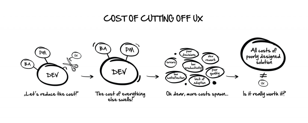
Second, it generates risks. Neglecting design means accepting the risk that the user will make careless mistakes, like the famous one the guys at CITY Bank made when they accidentally wired the full loan amount (interest and principal) to the creditors. It was as much as $7.8 million in interest and $894 million in principal — a total of roughly $900 million. The bank lost half a billion dollars here, and the error was caused by an unclear interface, poorly compatible with the real use case.
Reason three: UX is a cost
This is obviously untrue, but this INVESTMENT is rarely seen as such by companies. True, UX may become a cost, but that only happens if it is inadequate. Companies build new systems and tools driven by their price. UX design is then something you can safely disregard, because it is not your customers who will be working with this software, but rather your employees, who will do what you tell them to, whether they like it or not.
It is not until much later that you find out that doing things takes your personnel much longer than before. Or they make costly mistakes, like those at CITY. So maybe it is actually worth it to treat them a bit like users of customer-grade apps, where the UX is often the USP of the product? This is mostly a matter of attitude, one that is very different in corporations than in startups, where they prioritize the UX of their solution right from the drawing board.
Reason four: it just has to be complicated
This is a convenient excuse, even if it is not fair at all. You may assume that the users are involved in tasks of such complexity that enterprise systems simply cannot be easy to use (incidentally, if the processes are this complex, chances are a process-level UX audit would do wonders). But those who accept this reasoning are definitely not made to work with these systems day in, day out. Otherwise, they would quickly change their tune and invested in better UX precisely because of that process complexity.
Reason five: Technical debt
This is, fortunately, increasingly less common these days, thanks to the breathtaking rate of the digital transformation and of the adoption of new solutions. But you can still find systems so old that it’s simply better to leave them untouched, or the consequences for them will be dire.
Red flags
We could talk about the negative consequences of substandard UX in enterprise systems till the end of the world. The same goes for the causes of this sorry state of affairs. Above I have merely touched upon the matter.
But another, equally significant question remains unaddressed:
How do you know that something is not right?
The symptoms may vary, sometimes being difficult to spot. What they have in common is they should not be taken lightly.
1. Vox populi
Random critical remarks about the inconvenience of using company systems, overheard in the elevator or by the water cooler, should not be ignored. They are often dismissed as simple whinging, which is a mistake. Complaining is after all nothing else than users’ opinions, that is – feedback.
2. Low digital adoption
One of the conditions for a successful digital transformation is making it possible for the staff to efficiently perform their digital tasks. Training sessions are key here, as is effective onboarding, and in-app guidance and education, but what if – despite implementing these – the organization still struggles with the adoption gap?
This may mean that another factor is at play: the personnel DO NOT WANT to work with the new tool.
3. Excel is still king
I don’t mean to bash on Excel itself (which I use myself), but to point at a situation where personnel go outside the new tool to perform tasks which were supposed to be done inside it. If this is happening, if people are looking for functionality or information in places other than those that were planned during the transformation, then it is very likely mistakes were made in designing the usability and user workflow.
4. Something’s wrong with the data
Once upon a time, when we were conducting a large-scale survey among users of a certain BI system, one of these people told me that they make their report in Excel because they don’t trust the data.
The company has invested millions in the new system, and its employees… insist on using Excel spreadsheets. One of the primary goals of the digital transformation is getting your grubby paws on the treasure that is data. New tools are supposed to make it easy to work with data, generate reports, gain insights, and lay the foundations for making the most accurate business decisions possible. If generating reports takes too long, if the reports are riddled with errors, or data is presented in a way that is difficult to read, without clear hierarchy, proper information architecture or narrative (storytelling in reports is a subject worthy of its own article), then this is a huge red flag. This may mean that instead of using the ecosystem of solutions and apps in a way than conforms to the principles of the digitization strategy, the personnel engage in “guerilla activities”, because the new methods are badly designed, or the users do not trust them.
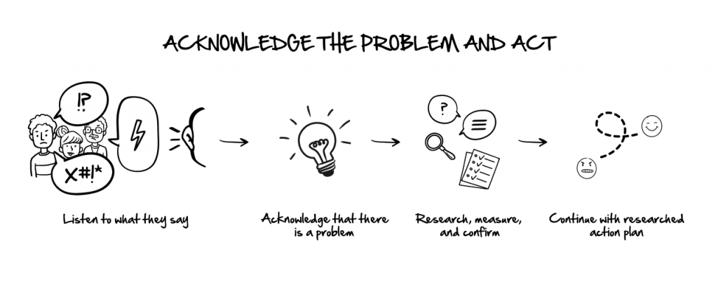
All this should be treated as a sign that perhaps the UX of the new enterprise systems is faulty or simply makes people’s work harder. These circumstances warrant being looked into closely. How does one go about it?
The simplest method, and one that is well-tested, is asking the users themselves. And this is best done with the proper tools.
USE SUS
The System Usability Scale questionnaire is a great quantitative tool to verify, rather easily and definitely reliably, whether the system, service or app in question is well-designed UX-wise. This is where you should start if you suspect things are not as peachy as they ought to.
The survey has 10 elements, each with five possible answers: from “Strongly Agree” to “Strongly Disagree”. Created in 1986 by John Brooke, it is well suited to rating many products and services, including hardware, software, mobile devices, webpages and apps.
The SUS rating method is better in all aspects than homebrew attempts. The questions are predefined and leave no room for manipulation (conscious or otherwise), which may elsewhere sometimes simply result from the fact that questions contain suggestions for certain replies.
To make the SUS survey work for you, i.e., give reliable feedback from the users, pay close attention to:
- the size of the sample group. My experience says that the lower limit should be about 10 people, while the upper – a few dozen. What is important that you do not have to include all users – that would be unnecessary expense.
- the possibility that SUS gives you to specify subgroups in the sample group. This should be borne in mind if you are surveying users performing different tasks in the same app. Make sure you define these subgroups properly.
- the fact that, like all surveys on a group of personnel, SUS needs to be well communicated. No-one likes research into how they work. It is really worth explaining to the participants what the goal of the survey is and drive home that they are not going to be judged or evaluated.
- the sad reality that people are less likely to be honest if they are being polled by coworkers. Outsiders are much more likely to get open, truthful responses. Thus, it pays to have the survey run by an independent third party.
Remember, SUS is not a silver bullet. It is a quick and dirty method that won’t pinpoint concrete problems or user groups, but only give you the basis to decide whether intervention is warranted. This method will tell you whether there is something wrong, but to find out exactly what it is and why, you’ll need to conduct a qualitative study. But this is a topic for a different, lengthy article.
It is the dawning of the Age of UX (in enterprise software)
UX is not pretty pictures, sleek buttons and the size of the company logo. It is an entire process, and an issue that is significant to everyone, regardless of their level on the organization chart. According to IDC research, spending on the digital transformation of business practices, products and organizations is forecast to reach $2.8 trillion in 2025, more than double the amount in 2020. With that kind of money, poor ROI on the digital transformation would be truly catastrophic.
Well-designed enterprise systems will make personnel more willing to use the tools you are, after all, implementing for them. And organizations will gain a competitive edge, becoming truly data-driven through proper data experience.
Would you like more information about this topic?
Complete the form below.