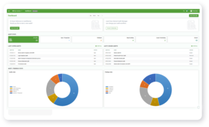
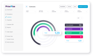
If I was to put into one sentence what a dashboard should be like, I’d say it should allow the clients to see what’s going on in their business, how to invest, where to implement a corrective plan.
After this spoiler we can start from the very beginning. Raw data is what I work with; it’s a resource that I use to create summaries, analyses and, needless to say, visualizations. Understanding and interpreting complex source datasets can be quite challenging to recipients who are not experienced professional analysts.
One solution to this problem is data visualization, i.e., displaying information graphically. This can be done by means of a graph, chart, map or as an info-graphic. As business decisions are made on the basis of data, and people better understand what they can see, I always make sure that all I create is clear and understandable to the addressee.
But let’s start with what business processes are, and what role data visualization plays in them. A business process is a series of tasks leading to a goal set by the company. Although there are a multitude of operating strategies, which are different in different company types, for the vast majority of these information analysis is key. Particularly now, in the era of big data’s growing importance, clear presentation of information is fundamental for its interpretation and the decision-making process. This makes good data visualization indispensable. With a workable idea and proper tools, visualizing even very complex datasets is not a problem for an analyst who specializes in this area.
Business expectations and dashboard creation
Organizations’ expectations for dashboards are high. Understandably so, from their business viewpoint — the dashboards are meant to be key tools in strategic decision making. This is something to always keep in mind.
The fundament for a well thought out data analysis is understanding the purpose and context of data. You need to know exactly what you want to show. The only ethical way to visualize data is to use it with honesty and transparency; information should be logical and coherent. In this regard, your analysis needs to be clear. It is expected to present the previously defined business needs. To avoid inconsistency from a business perspective, this can also mean ensuring the use of the proper and consistent business language for the terms and definitions used in your dashboard’s description.
Professional data visualization should help users make good business decisions on the basis of all available information. For this, you need proper data quality and consistency. This can be achieved by ensuring the data is reliable, or by adding data quality checks during dashboard creation. The end goal is that the user can always trust the data which is getting evaluated or reported. Skip these and even the best user experience from the dashboard itself won’t prevent it getting scrapped if the data is not looking right.
Action plans
They are what makes a visualization more than just a bunch of dry facts. Let’s start by sketching out what actions may be taken by the team in relation to the data you are presenting. Thus, the dashboard should show concrete relations that exist among the data. It’s worthwhile to use result comparisons and show information about set goals or targets in a way that will make it easier to filter out noise and arrive at the correct conclusions. This is helpful, for example, in sales analysis, where presenting both results already achieved and accepted targets facilitates further decision making.
One huge advantage a dashboard has over static reports is its interactivity. The fact that the user can broaden the context, drill up or down data and has access to more detailed data is of great importance. Also, any attempts to falsify data, quite easy in a static presentation, are much harder to pull off with a detailed exposition of data updated in real time in a dashboard.
Tell a story!
To tell a data story well, you need to know the context and the purpose of the visualization. It’s also important that the data remains open to interpretation along different paths, depending on the goal of the analysis. It is the end user who should make their own conclusions — the dashboard is merely a tool here, not the goal of the project; it helps the user not to get lost, understand the information better and come to conclusions. Before you even start to create the file with your visualizations, think about how data is applied in the environment you’re working in. There are many questions here (starting with the fundamental one: Is it meant to help research or to explain?), and it’s important to ask them before you begin work on the visualization, and keep asking them while you are developing it. This helps to make the process more comprehensive and to arrive in the end at a thorough analysis and presentation of the phenomenon in question. It is worth considering the organization culture at this point: what it pays attention to and what is required there. The users themselves may have their own needs and priorities that shouldn’t be ignored.
Would you like more information about this topic?
Complete the form below.


