
- 1. Introduction
- 2. A data visualization process that enables data-driven decision-making (DDDM)
- 2.1. Step 1: Determine the objective for the data visualization
- 2.2. Step 2: Identify the metrics that inform the decision
- 2.3. Step 3: Develop the story you want to tell
- 2.4. Step 4: Select the appropriate visual
- 2.5. Step 5: Add relevant elements to the visual to boost data literacy
- 2.6. Step 6: Clearly label and create a visual hierarchy
- 2.7. Step 7: Review the visual for clarity
- 3. Data visualization – ‘do’s and don’ts’
- 4. Data visualization is key when you want to become a data-driven organization
Introduction
As with most journeys, the destination is as important as how you get there. The data journey is no different. After taking data through collection, organization, and analysis, we must figure out how to pull it all together into something that tells a compelling story.
Data visualization enables effective data interpretation and contributes to a data-driven culture. It transforms processed information into visual results that we can see and interpret. This critical step takes the numbers, letters, and characters that make up data and converts them into graphs, charts, illustrations, and other visual elements that tell a story.
It also allows us to communicate business data more meaningfully and provides a way to express analyses and extract insights backed by evidence-based conclusions. This process ensures that our data journey efforts inform and educate while supporting data-driven decision-making (DDDM).
This article explores data visualization and helps us to understand just how this crucial step completes the data journey.
A data visualization process that enables data-driven decision-making (DDDM)
The data visualization process is vital to enabling us to make decisions based on our data. But if the data consists of information we can’t interpret, it becomes useless and doesn’t contribute to your data culture. Even once processed and cleaned, the endless lists, numbers, and lines of text can be impossible to decipher. Visualized data, however, is clear and understandable, even at a glance. This, in turn, supports DDDM, allowing us to extract the necessary insights to make the right choices.
As we explore the steps in the data visualization process, we’ll use a real-life example to help illustrate this final phase of the data journey. This project, carried out at C&F, assisted a pharmaceutical company who asked us to help them with their data journey.
Like many companies, this one faced data challenges from multiple between-system integrations, leading to issues in effectively transmitting and visualizing their sales data. This compromised accuracy and, most importantly, their ability to understand the data.
So, we integrated their data, bringing it from multiple data sources into a single source of trusted truth. This played a major role in allowing us to create dashboards. These dashboards present the data in a way that ties all the information together so users can comprehend and understand it.
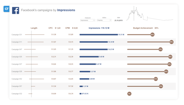
Below is a snapshot of that dashboard. We’ll be using it to help demonstrate the process steps more effectively.
We unpack the data visualization process in seven steps.
Step 1: Determine the objective for the data visualization
Before commencing, identify what data you want in the visual. Consider why you want it there and which decisions you hope the data will influence. How does it support your data strategy? Note the purpose or function of the company’s data you’re including, and don’t forget about who will be seeing and using the visualization. These basic elements will help determine the reasons for having particular data in the visualization and ensure we avoid simply including data just to ‘dress things up’.
The example above covers all of these points. The data relates to company sales and its ability to track sales performance. Results will inform future campaign decisions for the sales team based on the current relationship between the metrics.
Step 2: Identify the metrics that inform the decision
Metrics feed data-driven decision-making. However, too many metrics may complicate finding the information most relevant to the decision question. Identifying the right metrics in larger data sets means picking the ones containing the information most pertinent to DDDM.
Only pick the metrics you can gather accurately. If specific data isn’t available or the data you have is compromised, you can choose to launch a new data collection project – for example, a survey. You can also re-evaluate the data objectives and the decision question you’re trying to answer.
The example contains two sets of data metrics. CPC, seen in the second column, indicates how much the company pays whenever someone clicks on their ad. CPM shows how much they pay for every one thousand impressions or views of the ad.

Both of the metrics in the example are accurate and relevant. They help us establish if the budget is being spent right relative to how many people see the ad. Both are important to data interpretation and DDDM on the marketing front.
Step 3: Develop the story you want to tell
A vague or unclear data story can confuse and frustrate users. A good data story begins with establishing its purpose and context relative to the data itself. Allowing for data interpretation along multiple paths is important while enabling the user to develop their own conclusions along the way.
The dashboard is the perfect tool for telling this story. Its job is to host the analysis results in a clear, comprehensible way. Dashboards are a tool, assisting the user and providing them a space to understand the information and to draw conclusions.
The example’s dashboard does these things pretty well. The information tells a story, taking the user through each campaign, metric, and result. Users can also draw conclusions by taking more than one path to get there.
Step 4: Select the appropriate visual
Choosing the right visuals can make or break an effective data visualization. Pick wrong, and users may get distracted, confused, or lose interest. Pick right, and the story becomes a compelling one, engaging users and making the data understandable and clear.
Clear presentation of information is fundamental for its interpretation and the decision-making process. This makes good data visualization indispensable. With a workable idea and proper tools, visualizing even very complex datasets is not a problem for an analyst who specializes in this area.
BI Architects value data visualization through multiple means, providing flexibility and agility in presenting the data. But this also means that data should be presented clearly and understandably without overcomplicating things. Simple graphs are only the tip of the iceberg. There’s a whole selection of visualization methods to present data in effective and interesting ways.
Some of the general types of data visualizations include typical charts, tables, and graphs. These are perfect for demonstrating comparisons, relationships, and trends. More complex types include geospatial visualizations, like maps and infographics. These color and shape-rich elements are ideal for use in combination with other data interpretation visuals.
Different visualizations come with their pros and cons, but each one is suited to a specific role or purpose.
Visualizations are often found together in collections on dashboards to help analyze and present data. The dashboard example above is a great illustration of this. It contains a combination of different visuals, all working together to tell the data story.
Step 5: Add relevant elements to the visual to boost data literacy
Relevant color and design elements are also important to the effectiveness of data visualization. They can be used to enhance aspects, build consistency, and optimize functionality.
Color can be used to highlight trends and patterns and to reinforce consistency, while design techniques should be responsive and optimized for different screens and devices.
Avoid using too many colors, or users may experience visual overload, losing focus on the most important elements. Poor design can also negatively impact the user experience.
These elements are crucial to ensuring the effectiveness of the data visualizations for data-driven decision-making.
The example dashboard at the top of this section demonstrates this well. Note how the design and color elements on the right of the dashboard help us to perceive the campaign efforts versus the budget achievements.
Step 6: Clearly label and create a visual hierarchy
Using a visual hierarchy to help a user process information in order of importance guides how people experience the journey. It ensures that the right information is taken in, in the correct order.
Here’s how to build a clear, labeled visual hierarchy:
- Begin with designing a single widget – rather than applying a theme to all of them, allowing for a focus on optimizing to display data more easily.
- Understand the level of data – to display the most important data first, helping users differentiate between critical and secondary data.
- Pick colors for data visualization – that assist in navigation, helping users differentiate data sets.
- Add readability in dashboards – to guide users better in reading through the data, avoiding people reverting to default ‘F’ or ‘Z’ scanning patterns.
Color schemes, descriptions, typography, size, and titles may seem like minor visual elements. But they all play an important role in establishing a visual hierarchy. This hierarchy impacts heavily on users’ ability to find data as well as how much confidence they have in it.
Our visual above demonstrates an effective hierarchy. Data arrangement, flow paths, emphasis points, and correlations all guide the user through the data better. C&F analysis shows that an effective visual hierarchy can significantly reduce the time spent across your organization on viewing the data, reduce the analysis cost, and lower user frustrations.
Step 7: Review the visual for clarity
Finally, reviewing data visualizations enhances the clarity of the data presented. This allows us to fine-tune the details of the data visualization and optimize it for a better journey. Audience feedback and data usage analysis help with spotting any visualization issues and provide better insights into data interpretation, respectively. Staying on top of industry developments also ensures visualizations reflect the most recent trends, boosting confidence in the information within.
Using an iterative approach has allowed C&F to produce a data visualization on a dashboard geared around assisting with effective DDDM.
Data visualization – ‘do’s and don’ts’
- Do: Choose the visualization type (and tool) on the basis of purpose
Pick a visualization method based on the insights you want the audience to gain from the data. Depending on the data’s complexity, select the tools and techniques that cater to their preferences, expertise, and specific needs. Remember, they’re going to rely on data presented in your visuals.
- Do: Prioritize transparency and ethics
Be transparent and ethical in the data visualization. Only present logical, coherent, and clear information in the analysis. Also, demonstrate the predefined business needs, terms, and definitions. Consider using consistent business language to avoid inconsistencies.
- Don’t: Refrain from visual complexity
Balance simplicity with complexity in your visualization. This allows the audience to grasp key insights quickly while still having access to detailed, accurate data. Clarity and functionality should come first here to help your team become more data-driven in their work.
- Don’t: Don’t make data visualization-related decisions autonomously
Since visualizations represent the end-product of data transformed into insights, they must reflect a collaborative team effort. Visualizations destined for external or non-technical use should be reviewed by people not involved in the process. This feedback can then be used to iron out any issues. Incorrect charts for different data or blanks in the visual narrative are common problems and make it hard if not impossible to make data-driven decisions.
Data visualization is key when you want to become a data-driven organization
Good data visualization depends on finding the balance between form and function. While a simple graph may look slick, it may lack sufficient detail. A colorful visual design may boost appeal, but it might fail to convey the message or even overcomplicate things.
Data visualization is an iterative process that marries analysis with a story. The ultimate goal is to convey the data in a way that allows people to draw their conclusions (i.e., understand data) while navigating the story without getting frustrated or confused. People across the organization should feel that they have access to data they need.
It is an often tricky art, but when done right, data visualization enables truly data-driven decision-making, assists with effective data interpretation, and completes the data journey.
Would you like more information about this topic?
Complete the form below.